
Table of Contents
The Invisible Scale: Balance as the Soul of Interior Design
In the symphony of interior design—where color, texture, light, and form each play their own instrument—balance is the conductor. It is rarely the first element a guest can name, yet it is almost always the first thing they feel. Walk into a room that feels peaceful, inviting, and “right,” and you are experiencing the quiet power of balance. Walk into a room that feels jangling, unsettling, or incomplete, and you are likely witnessing its absence. Balance is the invisible architecture of comfort, the quiet glue that transforms a collection of objects into a conversation.
At its core, balance is the equal distribution of visual weight. But visual weight is a mischievous concept. It is not measured in pounds or kilograms, but in impact. A single large, dark wooden armoire across from a cluster of small, pale watercolor paintings might weigh the same physically, but visually, the armoire is an anchor, the paintings a whisper. To balance them, a designer must become a poet of perception, arranging objects so that their collective heft—measured in contrast, scale, texture, pattern, and even emotional resonance—feels harmonious rather than haphazard.
What Creates Visual Weight?
Before we can balance a room, we must understand what makes an object feel “heavy” or “light” to the eye. Several factors come into play:
- Darkness vs. Lightness: Dark colors (navy, charcoal, espresso) feel heavier than light colors (white, cream, pastel). A black fireplace commands attention; a white sofa recedes.
- Size and Scale: A large object naturally carries more weight than a small one, though a small, intensely patterned or brightly colored object can sometimes rival a larger, quieter neighbor.
- Texture: Rough, dense, or complex textures (chunky knit, raw wood, velvet) feel heavier than smooth, simple, or reflective surfaces (glass, polished metal, silk).
- Shape: Geometric, solid, or angular forms (a cube-like ottoman, a rectangular bookshelf) feel heavier than organic, open, or delicate forms (a wire-frame chair, a spindly floor lamp).
- Isolation vs. Grouping: An object standing alone carries more weight than the same object placed within a cluster. Solitude amplifies significance.
Understanding these variables is the designer’s first tool. Balance, then, becomes a careful act of negotiation: a dark, heavy sofa might be balanced by a pale, expansive area rug; a cluster of small, bright canvases might counterbalance a single, muted tapestry.
The Three Classical Strategies of Balance
There are three classic strategies for achieving equilibrium in interior design, each with its own emotional signature and practical application.
1. Symmetrical Balance: The Classic Sonnet
Symmetrical balance is the oldest, most traditional form of equilibrium. Imagine a formal living room: a fireplace centered on the wall, two identical sofas facing each other, matching table lamps on twin end tables, a pair of candlesticks flanking a mirror. This is balance by mirroring along a central axis. It speaks of formality, stability, and rest. Our brains crave symmetry because it echoes the natural order of our own bodies, the bilateral symmetry of leaves, and the quiet predictability of a calm lake.
The Emotional Effect: A symmetrically balanced room feels intentional, dignified, and safe. It reduces cognitive load—the eye knows where to rest because the composition is predictable. This is why symmetry is often used in courts of law, cathedrals, and luxury hotels. It communicates authority, permanence, and elegance.
Where It Works Best: Symmetry excels in hallways, grand entryways, formal living rooms, master bedrooms, and dining rooms. It is also deeply effective in small spaces, where asymmetry can feel chaotic. Two small sconces flanking a bed, for example, create a sense of order and calm in a cramped bedroom.
The Risk and the Rescue: Executed poorly, symmetry can tip from serene into sterile. A perfectly mirrored room can feel like a hotel lobby or a showroom—impersonal and frozen. The antidote? Introduce a single, unexpected element: a vibrant orchid at the center of the mantel, an asymmetrical throw blanket draped over one sofa arm, or a piece of abstract art that gently breaks the mirror. This “imperfect jewel” adds a breath of life without destroying the structure. The Japanese aesthetic of wabi-sabi—finding beauty in imperfection—is a perfect partner to symmetry.
2. Asymmetrical Balance: The Jazz Improvisation
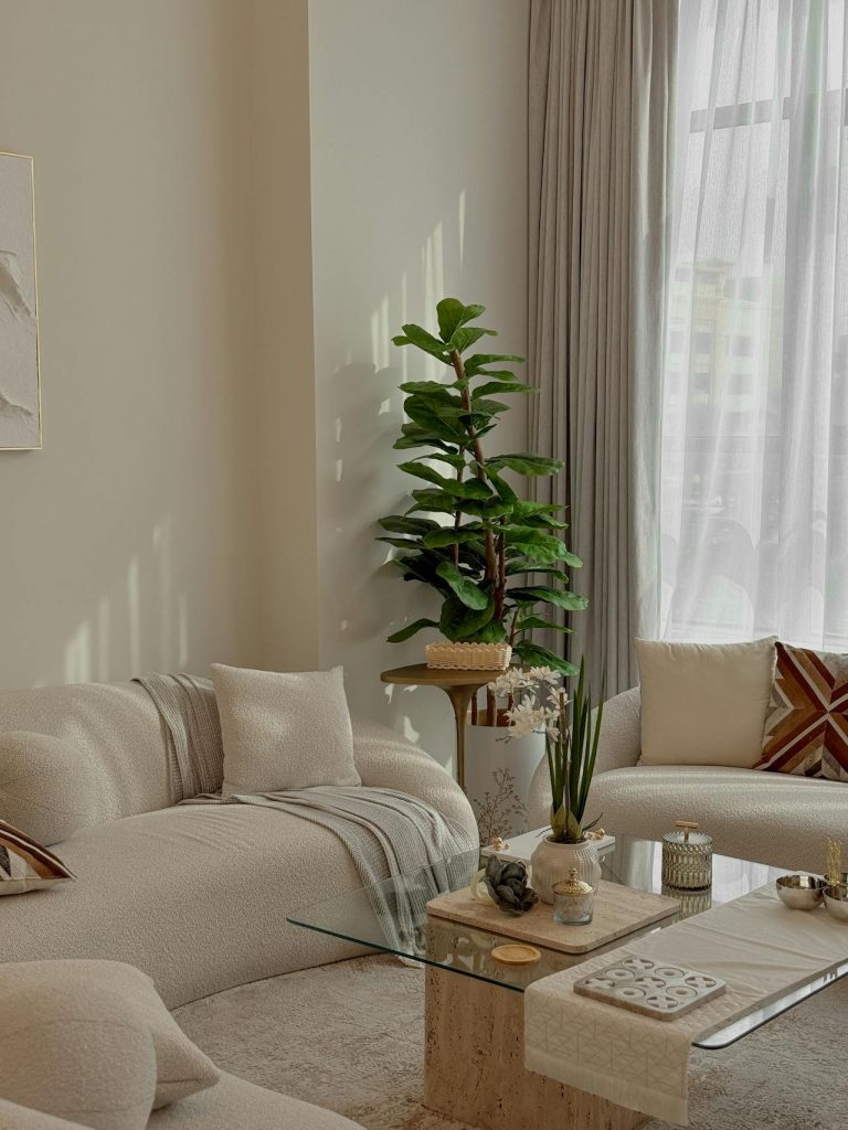
Where symmetry is a sonnet, asymmetry is free-form jazz. Here, balance is achieved not by matching objects, but by matching their visual weight across an axis. On one side of a sofa, you might place a tall, slender floor lamp; on the other, a low, wide basket filled with lush greenery. The lamp generates vertical heft and a line of light; the basket delivers horizontal, textural weight and organic color. They are not twins, but they are equals.
The Emotional Effect: Asymmetrical balance is dynamic, modern, and deeply engaging. It creates tension and release, movement and surprise. Where symmetry invites rest, asymmetry invites exploration. The eye travels across the composition, pausing, comparing, delighting in the unexpected. This makes a room feel lived-in, personal, and alive.
Where It Works Best: Asymmetry is the language of casual living rooms, eclectic bohemian spaces, modern lofts, and children’s rooms. It also works beautifully in transitional areas like hallways or reading nooks, where a fixed symmetrical layout might feel too rigid. Think of a mantelpiece with a large clock on one end and a cascading plant on the other, connected by a row of smaller books. No object is duplicated, yet the overall composition feels grounded.
The Challenge: Asymmetry is harder to achieve. It requires a designer’s eye for subtle calibration. A little too much visual weight on one side, and the room feels like it is physically listing. Too little contrast, and it simply feels chaotic rather than dynamic. The key is to use contrasting elements that clearly answer one another: tall vs. low, dark vs. light, dense vs. airy, angular vs. curvilinear. When done well, asymmetry feels effortless, as natural as the branches of a tree or the arrangement of rocks in a Japanese garden.
A Practical Exercise: Place a large, dark armchair on one side of a coffee table. On the other side, arrange a floor lamp (vertical), a small stack of books (horizontal), and a ceramic vase with a single branch (organic line). Step back. Does the armchair’s bulk feel answered by the lamp’s height and the books’ breadth? Adjust until the composition feels settled but not stiff.
3. Radial Balance: The Quiet Circle
The least common but most arresting form of balance is radial. In this configuration, elements radiate outward from a central focal point like the spokes of a wheel, ripples from a stone dropped in water, or petals around a flower’s center. Think of a round dining table with chairs placed evenly around it, a spiral staircase with a chandelier descending through its center, a circular rug with seating arranged concentrically, or a domed ceiling with painted clouds fanning outward.
The Emotional Effect: Radial balance creates a natural, circular flow. It draws the eye inward toward the center, then encourages the gaze to follow the outward rhythm. This fosters a sense of gathering, intimacy, and ritual. Unlike symmetry (which can feel formal and forward-facing) or asymmetry (which can feel dynamic but directional), radial balance wraps around the viewer. It is inherently inclusive and communal.
Where It Works Best: Radial balance shines in spaces designed for conversation or contemplation. Circular seating arrangements around a fire pit, a round breakfast nook, a rotunda library, or a bedroom with a canopy bed as the central focus. It also appears in architectural details: a circular window, a domed ceiling, a round skylight. Even a simple round mirror surrounded by a gallery of smaller frames can create a subtle radial effect.
The Caution: Radial balance must be used sparingly. Because it is so strongly centripetal (drawing everything to the middle), too many radial moments in one open floor plan can fracture the overall composition, creating multiple competing centers. A single, strong radial feature—a circular dining arrangement in one zone, a round seating cluster in another—often provides all the wonder needed without overwhelming the eye.
Beyond the Three: The Unconventional Fourth
Some designers speak of a fourth type: Crystallographic Balance (also called all-over or mosaic balance). This is the absence of a clear focal point or axis. Instead, repetition and uniformity of pattern create equilibrium. Think of a polka-dotted wallpaper, a gallery wall with dozens of small, evenly spaced prints, or a tile floor with a repeating geometric motif. No single element dominates; instead, the pattern itself provides stability. This type is often used in backgrounds, textiles, and floors to provide a neutral, calming foundation upon which other forms of balance can play.
Balance in Practice: A Room-by-Room Guide
- Living Room: Combine symmetry for major furniture (sofa, coffee table, rug) with asymmetry for accessories (pillows, art, lamps). This layers stability with life.
- Bedroom: Symmetry on the bed wall (two nightstands, two lamps) encourages rest. Asymmetry in a reading chair, a floor mirror, or window treatments adds personal warmth.
- Kitchen: Use symmetry for cabinetry and appliance placement. Introduce asymmetry with open shelving, pendant lights at different heights, or a single piece of large-scale art.
- Bathroom: Twin sinks and mirrors provide symmetry. A trailing plant, a sculptural soap dish, or an asymmetrically placed towel bar breaks the formality.
- Home Office: Symmetry behind the desk (matching bookshelves or art) creates focus. Asymmetry on the desk surface (a lamp on one side, a plant on the other) reduces stiffness.
The Living Principle
Ultimately, the greatest secret about balance is that it is not a rule to be followed, but a feeling to be tuned. No formula—whether the golden ratio, the rule of thirds, or a strict left-right mirror—can replace the designer’s own eye and intention. The goal is never perfect mathematical equilibrium. That would be cold, like a spreadsheet, or worse, like a hospital waiting room. The goal is felt equilibrium—a room that holds its tensions gently, where each piece feels heard by its neighbors, and where no single object shouts over the chorus.
Balance also exists in time. A room that feels balanced in daylight may feel lopsided under evening lamplight. A room balanced in summer, with lush green plants on one side, may tilt in winter when the leaves thin. Great design anticipates these shifts, using flexible elements like movable furniture, layered lighting, and seasonal accessories that can be adjusted as the room’s life changes.
When you walk into a well-balanced room, you might not notice the careful counterpoint of a heavy sofa against a light wall, or the echo of a round mirror above a square console, or the way a tall bookshelf answers a low credenza. But you will feel the result: a sense of coherence, of welcome, of a space that knows exactly what it wants to be. Balance, in the end, is the invisible hand that turns a collection of furniture into a home, and a house into a sanctuary. It is the principle that whispers, not shouts—and in that whisper, everything rests.
No responses yet